Sunday, October 30, 2011

Jillibean Soup Sketch

When I saw this sketch, I knew I had to make it. This is totally my style: clean and simple. I love the Jillibean papers and matching stickers!!

This is the sketch

And this is my take on it
PP:Jillibean Soup Homemade 6 Bean Soup - Navy Beans
      Jillibean Soup Homemade 6 Bean Soup - Black-Eyed Peas
Cardstock Stickers: Jillibean Soup Blossom Soup - alpha and flower
Label: Jillibean Soup Homemade 6 Bean Soup - Soup Labels
Border: Jillibean Soup Homemade 6 Soup - Pea Pod Parts
Circle: Jillbean Soup - Journaling Sprouts
Other: QK Studio - circle punch - grungeboard - Zig pen


Thursday, October 27, 2011

Get Picky Sketch Challenge

As usual I'm not doing anything untill the last moment. Same happened this evening with the sketch challenge for the Get Picky blog in honor of their first blog-birthday. And the result is that now it is dark and I'm not able to take a bright sharp picture of my layout..... Usually I scan my layouts to get the best result, but that is not possible when there are thick addings on your projects, like the rosettes on this layout. So I tried to get the best I could with my camera and hope for the best... Lesson learned: don't wait untill the last moment! Though I created this layout much faster than usual LOL

This is the sketch

And this is my take on it


Everything I used is from October Afternoon Boarding Pass collection, except for the metal rim from Making Memories.
These are pictures of my trip to Rome. On the left picture there is an overview of the Spanish Stairs (Scalinata della Trinità dei Monti) on the Spanish Square (Piazza di Spagna). The right picture is a more close up of the stairs with me on it in the middle. Not very obvious with this dark picture of the layout, but I will try a better one tomorrow.
Now off to bed, have to be at the office in 8 hours....*yawn*
TFL

Edit 10-28-2011: changed the picture of the layout to one made by daylight.

Monday, October 24, 2011

Bo Bunny Card Challenge Tuesday

Yes that is kinda shocking, right? Me doing cards!! But I really liked the sketch, so I thought let's give it try. I liked to pick a not so common subject for a card and that worked well with the Bo Bunny Barefoot collection.
This is the sketch

This is my take on it (I took the picture a little from the side, otherwise the colors didn't come out that bright as they are)

and a little 3D view ;-)

Patterned Paper: Bo Bunny Barefoot & Bliss - Laid Back, Word and Stripe
Card base: white cardstock inked with Distress Wild Honey and sprayed with a mix of water and perfect pearls
Top Border: Bo Bunny Barefoot - Backyard Bliss Cardstock Stickers
Airplane die cut: October Afternoon
Border Punch: Martha Stewart
Alpha dies: Quickutz Typist
Flowers: Hero Arts stamp on Barefoot Laid Back Paper, white embossed it
Ribbon: unknown 
Corner punch

TFL

Sunday, October 23, 2011

My Mind's Eye Blog Challenge 28

Today I enjoyed My Mind's Eye Challenge #28.
This is what the challenge is:  Design a layout based on this wonderful sketch and use “FALL” as your theme (sketch by Anam Stubbington).
This is my take on it:


MME Stella & Rose Mabel "Joy" Crocheted Paper
MME Stella & Rose Mabel "Joy" Woodgrain Paper
MME Stella & Rose Mabel "So Sweet" Herringbone Paper
MME Stella & Rose Mabel "Little Lady" Posies Paper
MME Stella & Rose Label Stickers
MME Stella & Rose Sticker Tag
MME Good day Sunshine button diecuts
Tim Holtz grungeboard alpha
Tim Holtz Rosette Die
Stiched the papers by hand

As I don't have that much fall pictures, I had to search for them. These are pictures of my little niece Chelsie when she was only 1 year old (she is 7 now, time flies!!). I thought those would be perfect for this sketch and choose to print them in black and white because the papers are bright allready and now the pics pop out of the page pretty well. TFL

Thursday, October 20, 2011

Canvas project

Last weekend I finally started with the canvas project from the Online Cardclass by Jennifer McGuire. This is a two week online class with daily a video and pdf with instructions. It is all about card making, but the techniques can easily be used in scrapbooking. The meaning of this class was to learn a lot of different techniques with stamping, inking, painting and embossing by using different backgrounds like cardstock, glossy paper, sticky-back canvas and watercolor paper. To easily work with all of these techniques, you could make a canvas with 23 hearts. Each heart represents a different technique and by adding them on a canvas you create your own inspiration board. Besides that, it is an eye catcher in your scraproom! I loved making this canvas. Some techniques I liked better than others, but it is was fun to try them all. Below you'll find the canvas and some detail photo's. TFL


Friday, October 14, 2011

Get Crafty with Cleetus

Today I just want to share some scrappy hilarious stuff with you. It doesn't need any explanation, just enjoy Get Crafty with Cleetus ;-)


Wednesday, October 12, 2011

The best gifts...

...are the ones you give your self! I finally got my order from Simon says Stamp and I can't wait to play with all of it. Like I said before, I ordered a LOT. But I was thinking "well I'm allready ordering, so maybe I should also get some more Distress Inks to complete my set...and oh I need some more ink blending tools...and that cling stamp is cute, and that one too....and wasn't I running out of glue dots and glossy accents??" So you can imagine how it became so much ;-) And then when the box is finally there, it feels like Christmas. All those (sort of) presents...and they're all for me YAY. Feeling like a child! Well, you scrappers know what I mean, don't have to explain this feeling. Just have to show you the stuff :-)


Monday, October 10, 2011

I rather model than eat

Here is my first Bella Blv. layout, created with the goodies I got. I don't know why, but I find it harder to create pages with bright colors than the more vintage papers. I always seem to want to ink edges but I actualy don't want that when I use bright papers like these. So I have to hold myself back. Does it make sense ;-) How about you? Do you find it easier to work brights or vintage? Or doesn't it matter?


Besides the Bella products, I used QK Heidi Swapp Handwriting and grungeboard for the title (the words model and eat are Bella stickers). The chips I put 'model' and 'eat' on are cut out of grungeboard as well. TFL

Friday, October 7, 2011

Jumpin' up and down

Yes, that's what I'm doing right now! I'm so excited.
I came home from work and found an international package that was delivered. First I was kinda disapointed because I ordered a lot of stuff at Simon says Stamp (and when I say a lot, I mean a LOT) and it was not possible that all that stuff would fit in this box. So I started opening it and there was the Bella Blvd logo. All radars in my head started spinning and yes there it was, somewhere hiding in the back of my head. Stephanie Hunt (product designer and owner of Bella Blvd) did a catalog test last summer to see if people really read her personal note in the catalog. At the very end of her message she included the giveaway test, wich meant that if you have been reading that, you had to sent Stephanie an email with the subject 'I got your note' and you were able to win a package worth $50 of free Bella goodies. I did sent her that email in August, but completely forgot about it. And now, almost 2 months later there it is: my package worth $50 of free Bella goodies!!! It involves many double-sided patterned papers, stickers, chips and a clearstamp of the Midterm and Hello Beautiful collections. What a big surprise and such a great way to start my weekend. The weather is gonna be horrible this weekend, so guess what I'm going to do the next couple of days....that's right, playing with my goodies. Below you'll find a picture of the goodies so you can jump up and down with me ;-)

Wednesday, October 5, 2011

Canvas experiment

I'm planning to create three 16x16 inch matching canvases to fill up an empty wall in my livingroom. But before I start with the big canvases, I'm doing some experimental stuff with techniques on small canvases. Today I did a 5x7 inch canvas.


I will show you step by step how to make this one.
First you stamp the background with a Hero Arts background stamp and Versamark and heat emboss it with white embossing powder. Then you ink the whole canvas with Distress Ink Faded Jeans, using the Ink blending tool. You can ink all over the embossed pattern, it works like a resist.


The next step is the lower right corner. You use a mask (I used one of Tim Holtz) and ink the corner with Distress Ink Walnut Stain. Wipe out the ink on your blending tool on all the edges of the canvas, so the edges look blurry brown / blue.


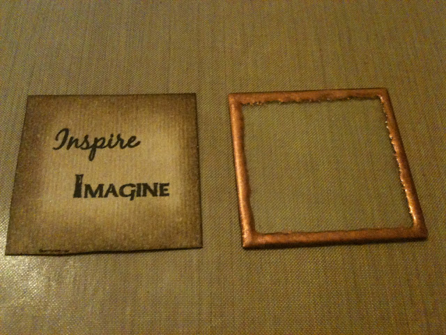
For the right upper corner you heat emboss the edges of a square piece of glass (inksentials) with copper embossing powder. Behind the glass you put a square of white cardstock which you ink with Distress Ink Walnut Stain (dark on the outside, lighter on the inside) and stamp with a phrase or word.


For the flower on the upper left corner you cut a 1,5 inch strip out of an A2 size piece of cardstock and punch one side of it with a scallop edge punch. Ink this strip both sides with Distress Stain Walnut Stain and dry it with the heat tool untill it is nearly dry. Crumble the strip to get an aged look and spread it out again. Heat dry the last wet pieces of the strip. When it's completely dry you put a cut in between every scallop. Don't cut all the way up to the edge but leave 1/8 of an inch. Then put a strip of 1/8 inch double sided tape on the non cut edge of the strip and start rolling the strip in on the adhesive all the way till the end and your strip is completely rolled up. Spread out all the pettals and your flower is done.


This is what the flower looks on the other side.
Sand the edges of the picture and distress a piece of cardstock with Distress Ink Walnut Stain.


Put all the elements on the canvas and your canvas is done!
TFL

Monday, October 3, 2011

Welcome!

Welcome to pics and cheesecake! On this blog I will share everything about scrapbooking: layouts, (mini) albums, altered items and everything else that comes along. Let's start with a layout I made last week:


This is one of my favourite pics from my last Florida trip: me and my best friend/cousin on a beautiful spot. We have tons of pics of us together from the time we were young, but not so many from the last couple of years. It's not that weird, cause when you're a kid your parents take pictures of everything you do. And when you're getting older not everything is that funny, cute and adorable anymore ;-) Now it's the time WE take pictures of funny, cute and adorable kids. So this picture of us together is kinda special to me.
For this beach setting I love the pp of BoBunny, the colors are perferct for it. Combine that with Wild Honey Distress Ink and Aqua and Sunset Orange Adirondack dabber and there is a great combination. For the word 'Clearwater' I used QK typist and grungeboard. I painted the letters with sunset orange and than I stamped it with a small travel definition stamp. Just a tiny little experiment, but I love the result. Unfortunately it is not really visible on this picture. TFL